


Over recent years, PrusaLab has changed significantly. From an open workshop, it has gradually become a technological and creative hub for product development, startup support, artistic projects, experimental production, and collaboration across Prusa Research.
And it was at a certain point that we realised our original visual identity could no longer adequately encompass this breadth.
Black and orange had long been a strong and easily recognisable foundation. Over time, however, they started acting more like a restriction. PrusaLab now communicates a much broader range of topics, and one distinctive, yet very narrow, visual style was no longer enough.
So it wasn't a matter of throwing away the old identity. Rather, we needed to create a system that better reflects what PrusaLab is today and where it wants to move next.
Identity as a construction kit
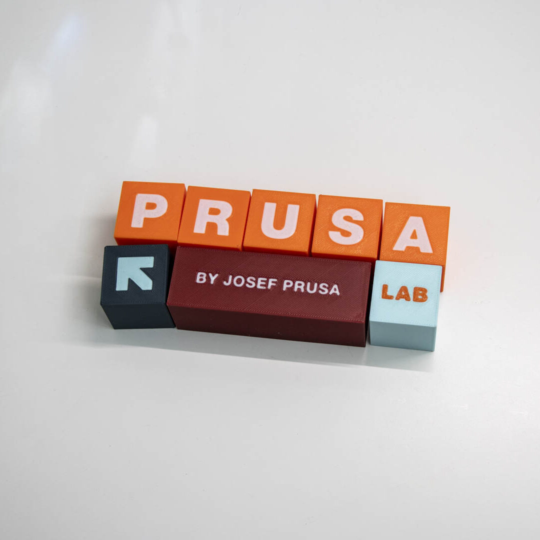
The new visual system is based on the principles of playfulness, modularity and composition.
Its basic building block is a square, or a cube, or a „brick“ in 3D. This simple element can be scaled, moved, combined and stacked into new structures. It works as the basis for the logo, graphic layout, text block, photograph and illustration.
This is not about a predetermined template, but rather a flexible system that can be adapted to specific content. Each use can thus create a different visual solution without losing brand recognition.
This principle corresponds to PrusaLab itself. It also connects various fields, approaches and types of projects, giving them space to emerge, change and develop. The identity therefore combines technical precision with playfulness, openness and a willingness to experiment.
Building on Prusa Research, but staying true to ourselves
The new identity was not created separately from the world of Prusa Research. On the contrary, we wanted to strengthen the visual connection between both brands where it makes sense.
The font remains the same and helps to unite PrusaLab with the visual language of Prusa Research. We are also keeping orange as one of the key colours.
However, they are joined by other shades: bordeaux, petrol blue and light blue-grey. The new palette allows us to work much better with different types of content, while also symbolically reflecting the fact that PrusaLab is long past being only about 3D printing.
Individual colour combinations are supplemented by symbols enclosed in squares, which help to distinguish various areas of our activity and at the same time expand the entire visual vocabulary.
The result is an identity that is closer to Prusa Research, while at the same time having enough of its own elements and energy for PrusaLab to retain its own character.
We created most of it ourselves
The very process of creating a new identity was actually very similar to the way we approach technical projects.
Rather than simply outsourcing the entire rebrand, a large part of the work was done within our team. Gradually, we defined what worked in the original identity, what was holding us back, and what we really needed from the new system.
We invited external designer Matěj Smetana from the FullMenu studio to join the process in the role of consultant and mentor, helping us to organise, advance and translate individual ideas into a functional visual system. However, the actual decision-making, testing and a large part of the implementation remained with our team.
It was an important principle for us. We didn't want to create an expensive design facade, but rather a tool that we understand ourselves, know how to work with, and are able to develop further without dependence on an external supplier.
The new identity is therefore largely the result of the same approach we use for our projects: first defining the problem, designing a system, testing it in practice, iterating and gradually arriving at a solution that truly works.
New website as another part of the change
The original website was gradually becoming outdated and failing to meet all the technical requirements we need today. It was therefore necessary to embark on its rejuvenation not only in terms of its visual appearance, but also regarding its technical solution, structure, and functionality.
At the same time, it could no longer fully reflect, either in content or visually, how far PrusaLab has evolved in recent years. Many important projects, services and activities were difficult to find, and the whole website functioned more as an archive than a tool to quickly explain to visitors who we are and what they can approach us with.
The new design therefore gives much greater space to stories and examples from our projects, the projects of our members and supported startups, as well as news, events, courses, lectures, workshops and the people behind PrusaLab.
We want the visitor to understand within a few minutes not only that we have 3D printers and a well-equipped workshop, but most importantly, what kinds of problems we can solve, how we work, and how diverse our expertise is.
For us, the web isn't just a presentation space. It's supposed to work as a practical tool for new collaborations, sharing know-how, and documenting the projects we work on.
So what actually changes?
At first glance, it will seem like a lot. Colours, graphics, layouts, the website and the way we work with visual content.
The essence of PrusaLab remains the same, however.
We still enjoy projects the most where it isn't clear at the beginning what they will look like exactly at the end. We still combine 3D printing with engineering, electronics, digital manufacturing, design, art or science. And we still want to be a place where a good idea can be turned into a real thing.
The new visual identity is to help us show this reality more clearly, colourfully and confidently.
Not because we would start acting like someone else.
But so that PrusaLab finally looks as broad, playful and diverse as it actually is.


